Honey Dew Rebrand
Services: Art Direction & Design
-
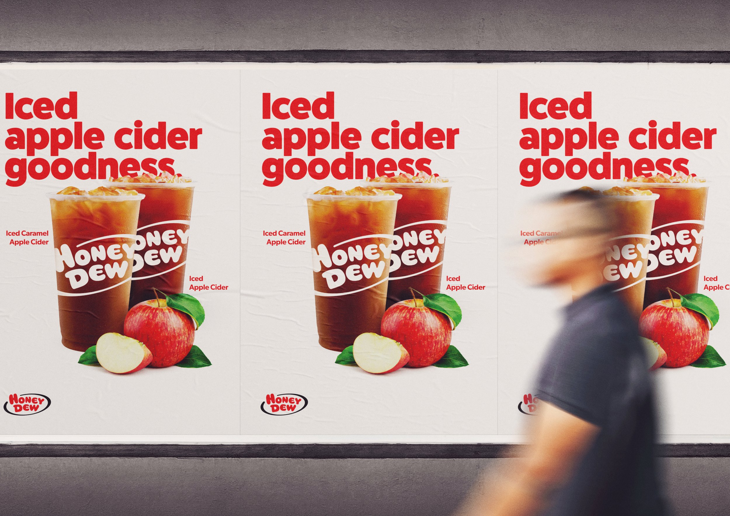
The Honey Dew rebrand was designed to transform the coffee and sandwich chain into a beloved local brand for New Englanders, positioning it as an authentic, down-to-earth community favorite. The rebrand focused on creating a genuine image that extends beyond typical coffee shop offerings, by emphasizing a commitment to community and quality. The strategy involved enhancing the brand’s alignment with New England values through tailored messaging and a refreshed visual identity.
-
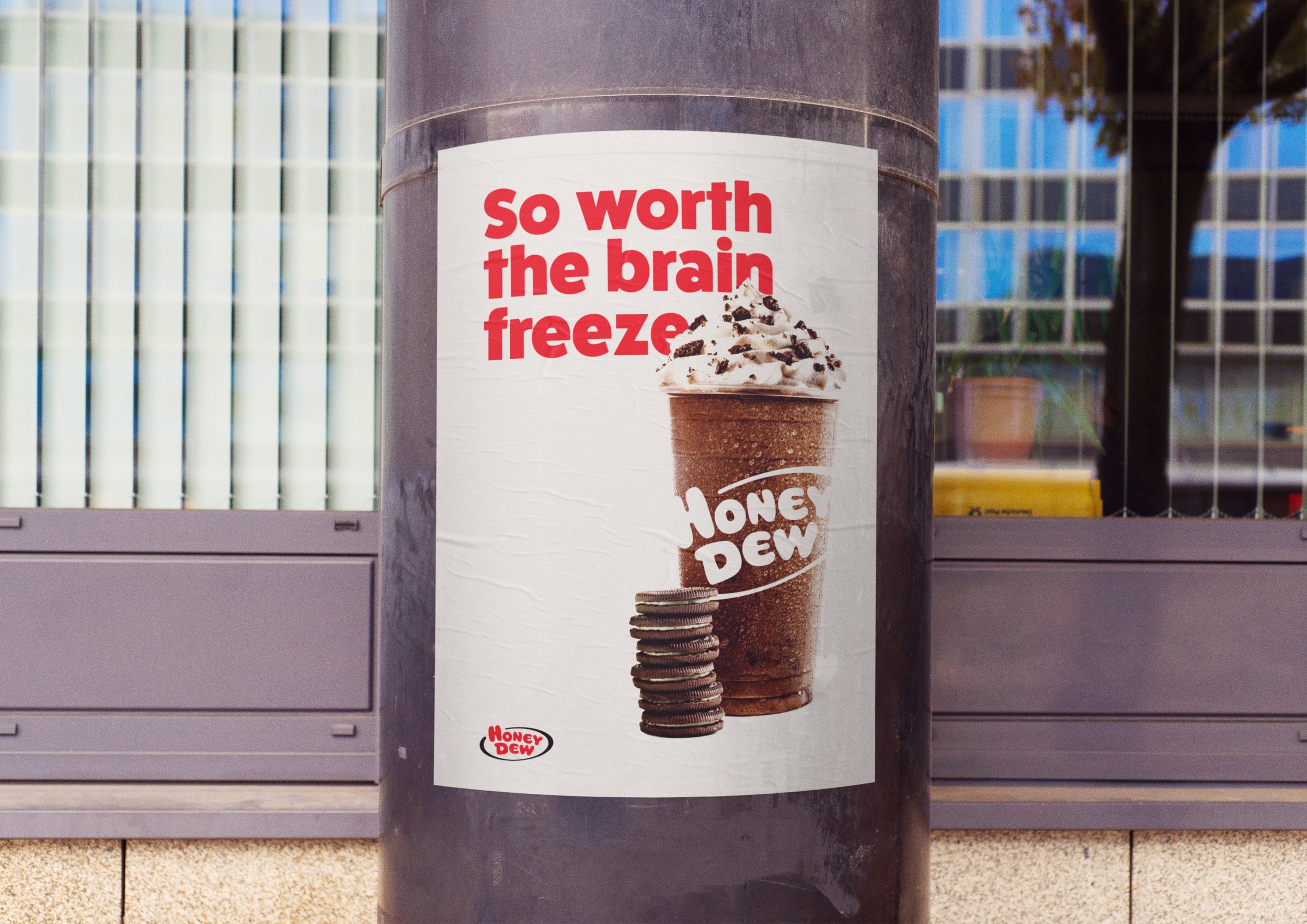
I worked with a team at Viewpoint Creative to rebrand Honey Dew, aiming to align the brand more closely with New England values by emphasizing its genuine and hard-working nature. The rebrand featured a clean, bold aesthetic with consistent fonts and colors, which enhanced the premium and enticing look of Honey Dew’s offerings. This approach not only distinguished Honey Dew from its competitors but also reinforced its community-focused image.
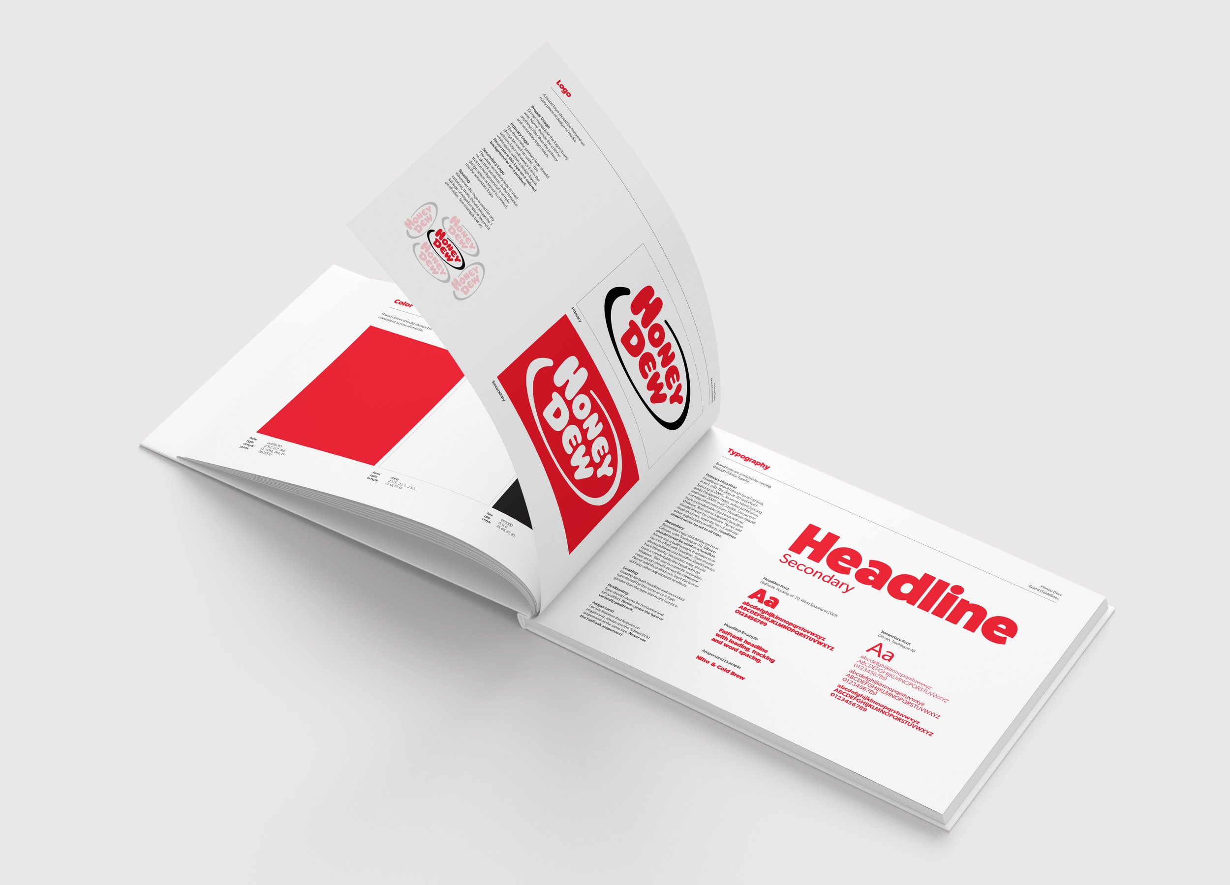
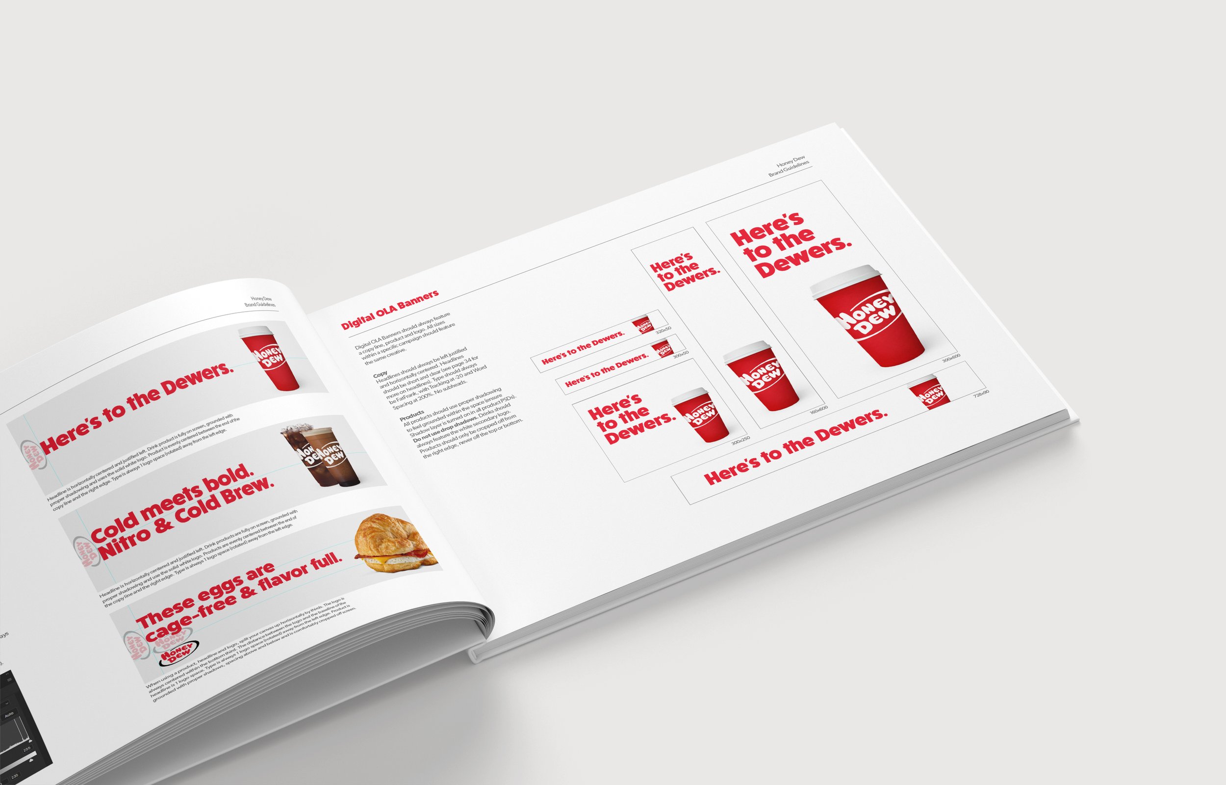
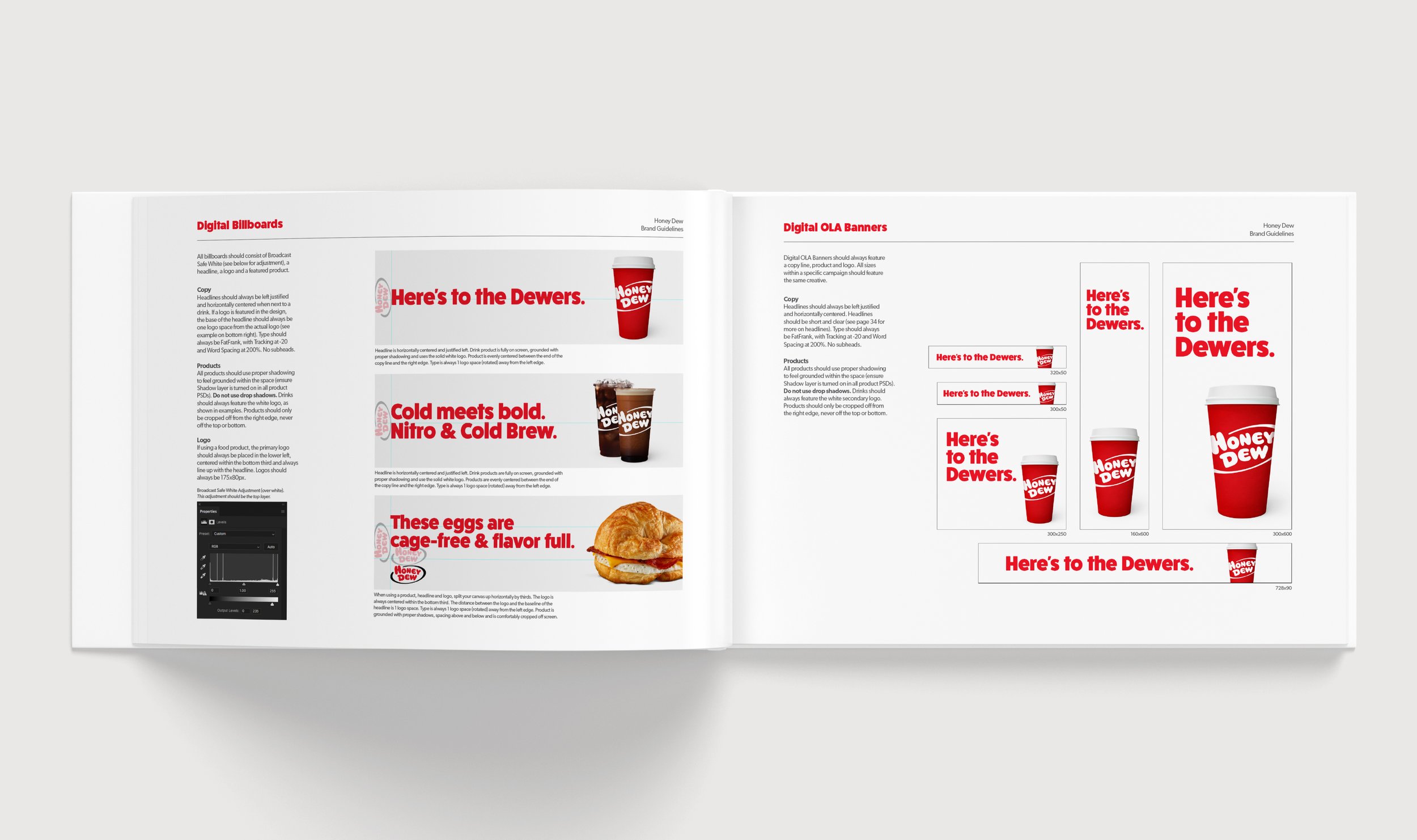
As the design lead, I developed in-store materials and comprehensive digital assets for advertising. I also crafted the new brand guidelines, detailing the use of logos, typography, color schemes, and imagery to ensure consistency across all communication channels. These contributions were pivotal in implementing the visual aspects of the rebranding strategy, ensuring a unified and appealing brand presence.
